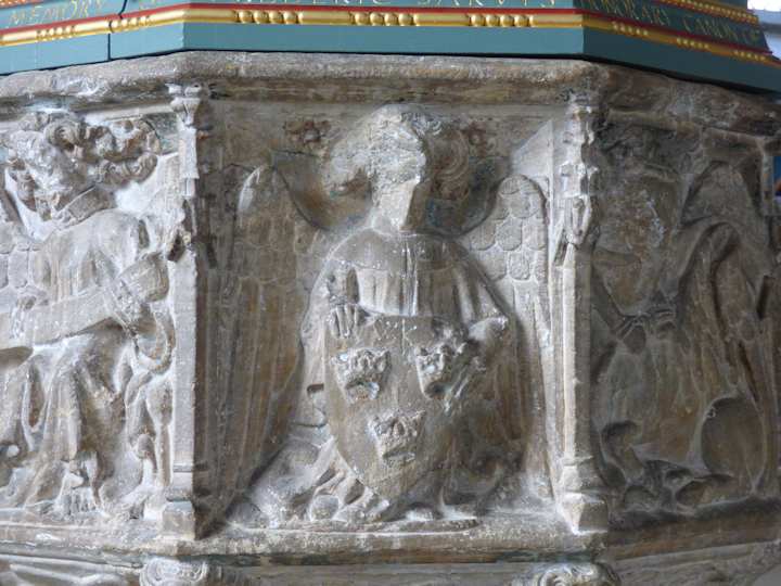
If you return to the back of the church along the north aisle you will find the medieval font dating from the mid 15th Century. This too would have been painted, and it is possible to see some remains on the background of one of the panels if you look hard. But as with many medieval church furnishings this was defaced after the reformation, any human or human-like face violently broken off in case one should worship an image of God or saint rather than the true God. The font still has its original lead lining and is deep and wide inside because in medieval times children were baptised by full immersion. Like most fonts of this period, you will notice that it is octagonal. The geometry of the eternal is such that God who has no beginning nor end is often represented by the perfect circle, while humankind is but a blocky imperfect square. The octagon seeks to bridge the difference and by communing with the divine in baptism we mystically attain a new relationship with the divine. New Testament theology bridges this gap with the coming of the Holy Spirit who is there to represent ‘Christ in us, the hope of glory.’ and bring about a closer relationship of love and dependence with God the Father and God the Son.

If you are puzzling that the heavy cover, which is from 1953, that it has no easy means to hoist it from the font, stop puzzling: it is a permanent cover and it is hinged and opens up from the side!